Daily Struggles
Forms are used on a daily base, almost everywhere.
Below are some I have come across that I feel their user experience could be improved.
Booking confirmation: reducing travel stress
The form below is part of the process of confirming your flight booking with Swiss Air
Residence address and Destination address tabs look like a button, similar to the Confirm button at the bottom of the screen
It is not clear which addresses are required at first because both forms load auto-filled with the same address
“Add another email address” and “Add another phone number” buttons look deactivated and non-functional
The white font on the red background in both the Confirm button and Residence address tab fails in the accessibility test of WebAIM with a contrast ratio of 4.8: 1; WCAG Level AAA requires a contrast ratio of at least 7:1 for normal text and 4.5:1 for large text.
Problem
What did I do?
I redesigned the form by:
Creating two distinct sections for both types of addresses.
Adding a checkbox in case the Destination address is the same as the Residence Address
Changing the look of “Add another email address” and “ Add another phone number” buttons to include an icon and placing those next to the fields, respectively
Changed the text weight to bold and increased the font size to improve the contrast ratio from an accessibility perspective in the Confirm button
Streamlining the Payment Details Process
Problem
The mobile version of booking a road test in Ontario, Canada has these minor UX issues
Submit and Cancel buttons have the same visual hierarchy, thereby creating confusion.
Province and Country fields: the user must reside in Ontario to take a test. Those 2 fields for province and country create redundancy in entering data, especially since the form is not filled automatically when the postal code and city are entered.
What did I do?
Helping Children Manage Their Alarms is now Simpler
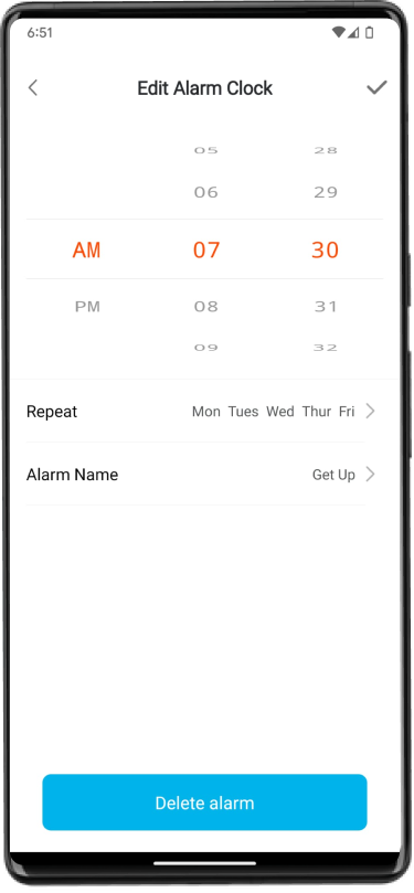
My child’s fitness tracker app has an alarm feature that he loves to set as part of his morning wake-up routine.
Problem
The Call to Actions are either Save or Delete the alarm. The “Delete alarm” button is in blue at the bottom of the screen, while the Save action is a check icon at the top right corner
By default my son tapped on the blue Delete Alarm button when he changed his alarm and wanted to save the changes
What did I do?
Reduced Mental Effort During Login
This app is used by parents/guardians or high school students to pay for all activities related to the school.
Problem
When entering a wrong password, the login error message appeared as a red button, I tapped on it without reading the message thinking it was the sign-in button!
I was confused for a while because nothing happened
Additionally, the red colour usually indicates an alert/error. It may not be seen by colour-blind users


